Unterstützer, Tools & Plattformen
Vibe Coding Summit in Berlin · 2. Juli 2026
Sei dabei, wenn UX und Softwareentwicklung sich neu erfinden. Was gestern Wunschdenken war, programmieren wir heute in Minuten.
Worum geht es
KI verändert die Anforderungen an UX Design und Software Entwicklung – an die gesamte Arbeitswelt – fundamental. Beim Vibe Coding Summit stellen unsere Expert:innen ihre Projekte vor, teilen Learnings und diskutieren mit Euch, wohin die Reise geht.
Wir wollen die treibende Kraft hinter dieser Entwicklung sein – und sie gemeinsam positiv gestalten. Das ist der Kern unserer functional aesthetics Community.
Unterstützer, Tools & Plattformen
Programm
Ein kompaktes Format – 3 fokussierte Talks, echte Learnings, offener Austausch.
Ankommen, kennenlernen, loslegen.
3 Expert:innen präsentieren ihre Vibe Coding Projekte: Was wurde gebaut? Wie? Was habe ich dabei gelernt?
Tips, Tricks und aktuelle KI-Entwicklungen – gemeinsam diskutiert.
Informelles Netzwerken zum Abschluss des Abends.
Warum teilnehmen
Kein Marketing-Bla – echte Projekte, echte Fehler, echte Learnings von Praktiker:innen.
Triff die Community, die Design, Code und KI zusammendenkt – klein, exklusiv, auf Augenhöhe.
Wir sind die treibende Kraft hinter der Entwicklung – und du kannst dabei sein.
Bleib auf dem neuesten Stand der KI-Entwicklungen im Design-to-Code-Prozess.
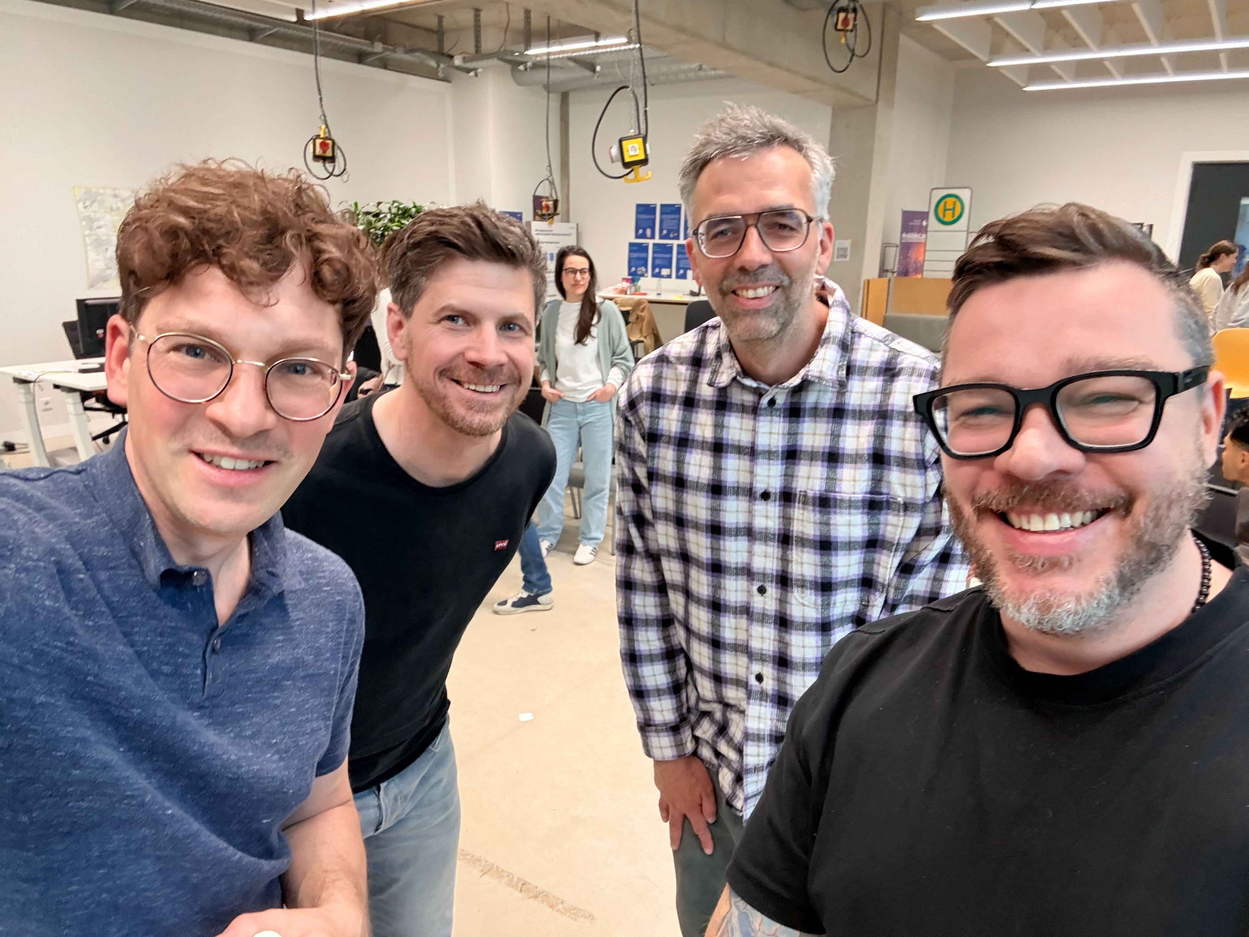
Das Team
Unser Team vereint Expertise aus Design, Entwicklung und Produktstrategie.


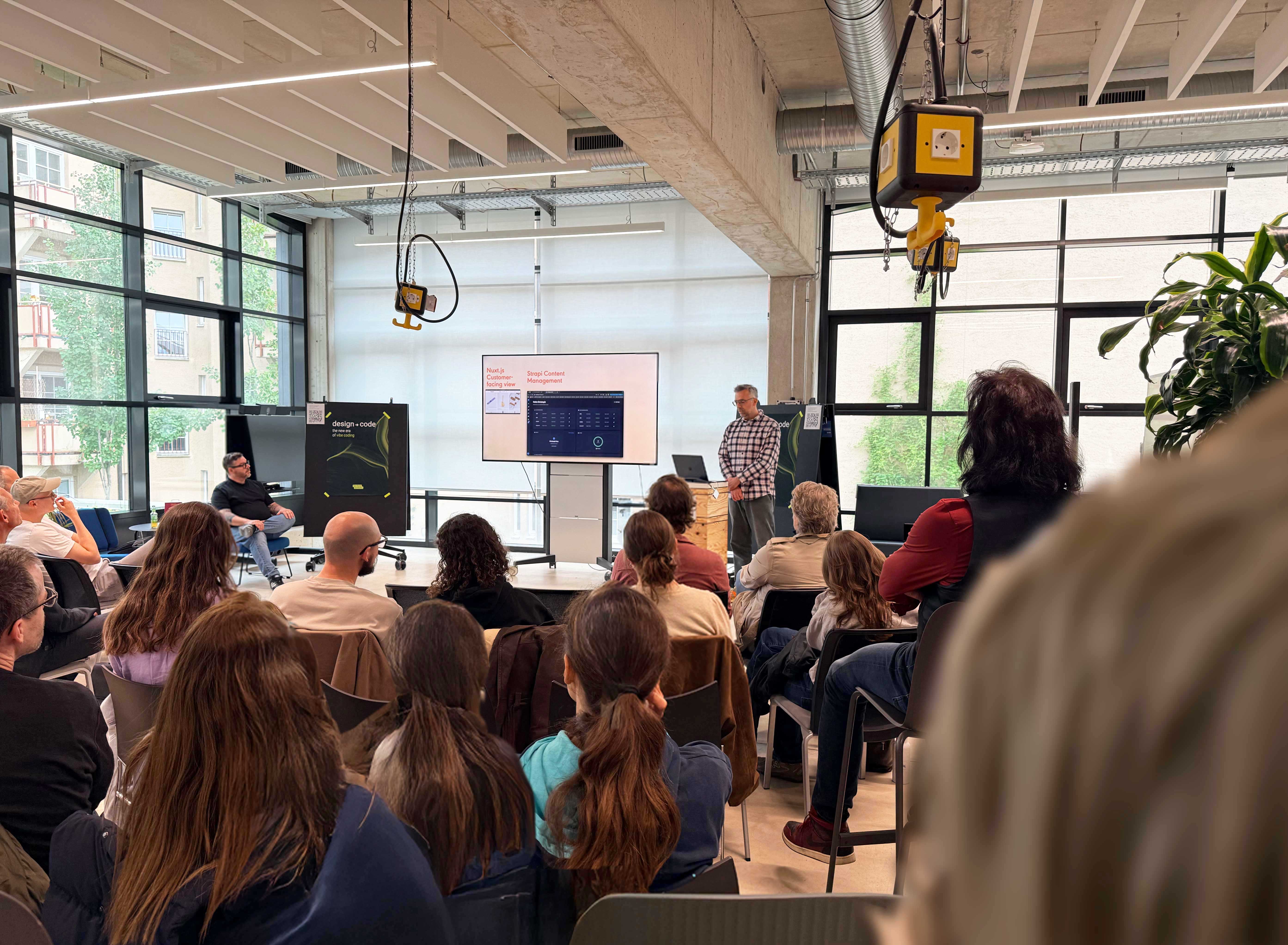
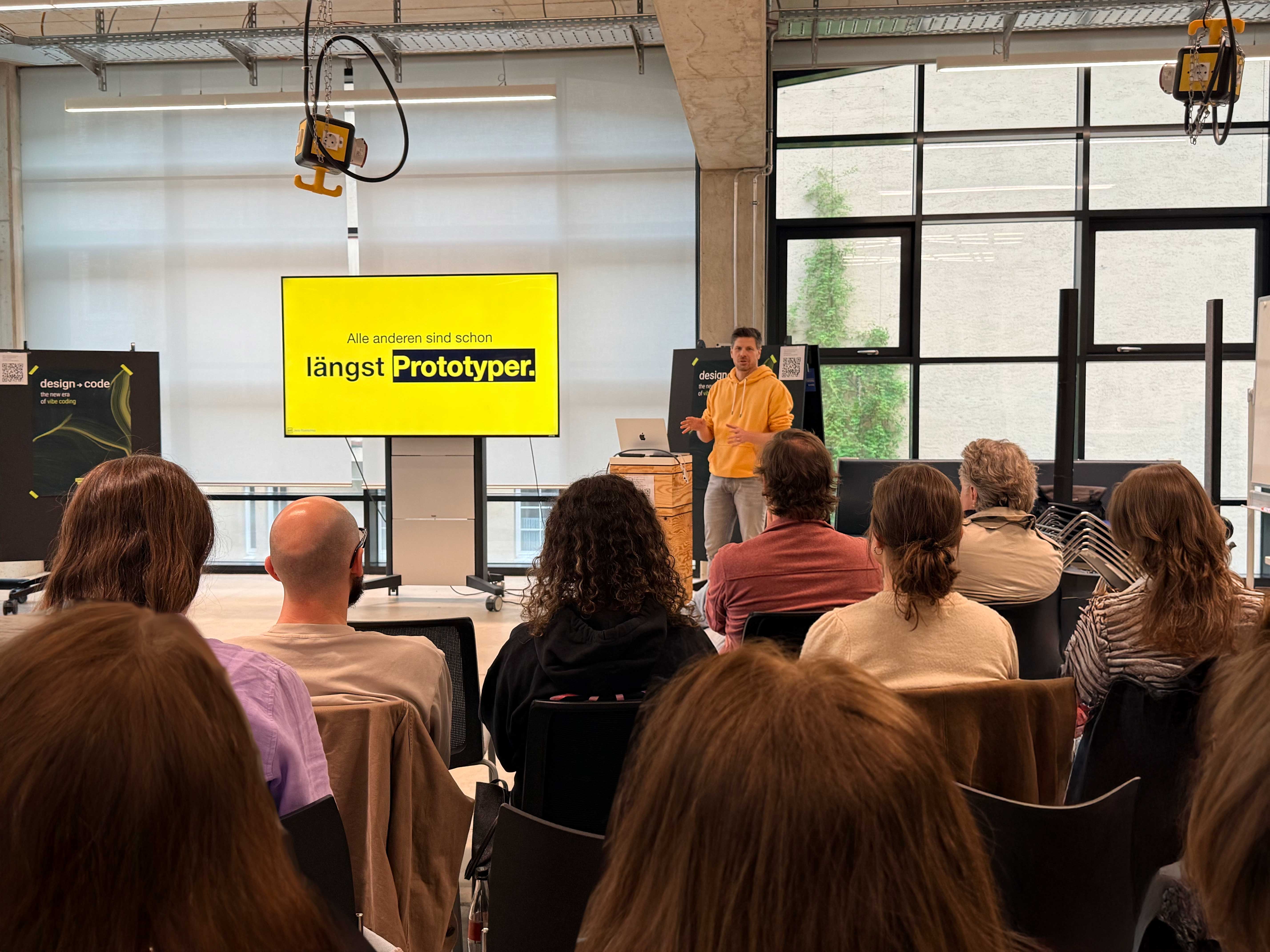
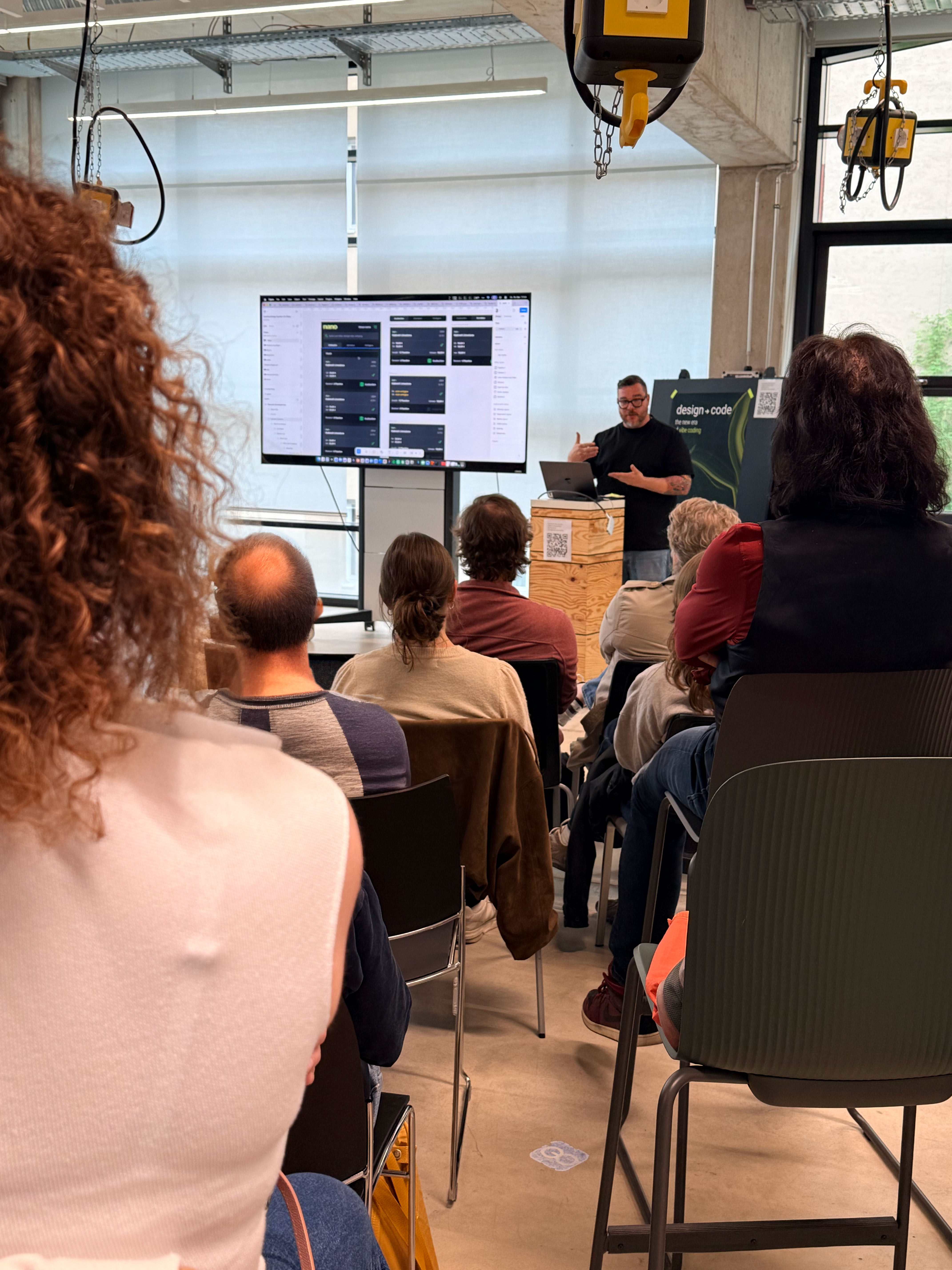
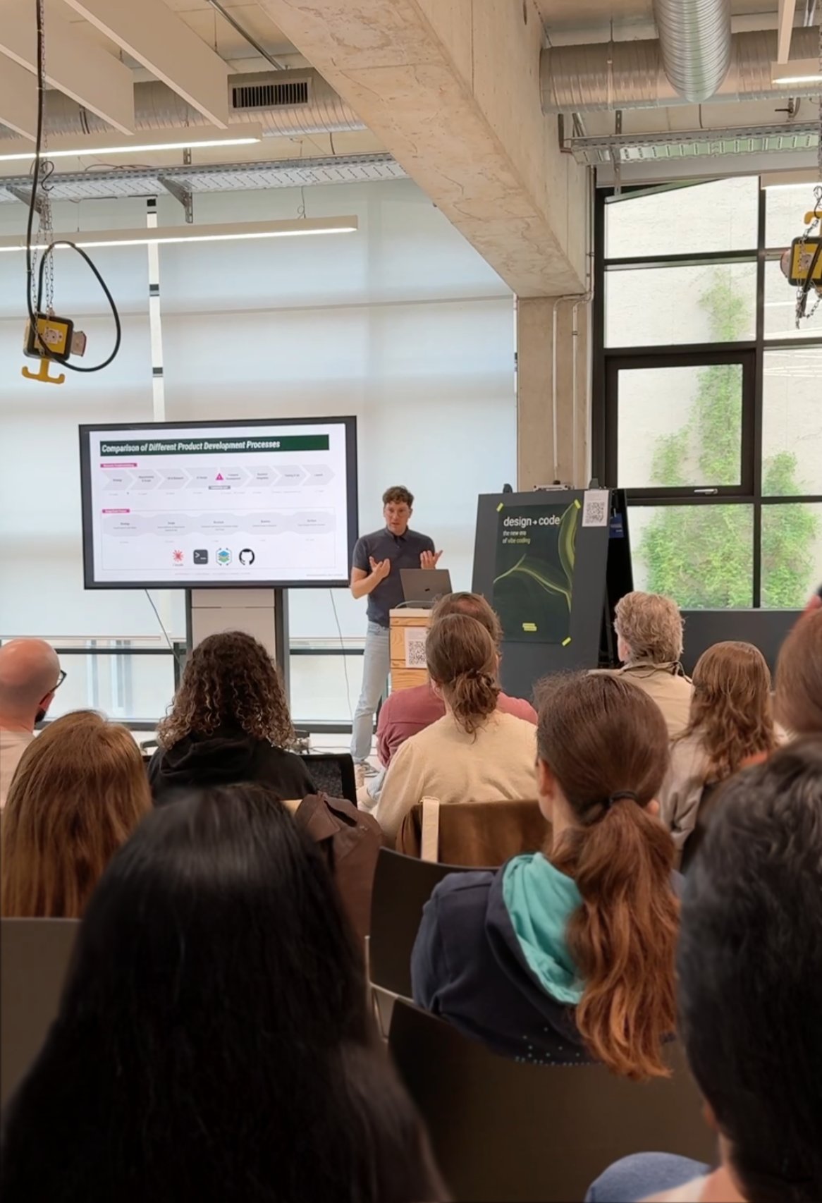
Rückblick
Ein voller Saal, fünf inspirierende Talks und viele spannende Gespräche. Danke an alle, die dabei waren!
Der 2. Vibe Coding Summit findet am 2. Juli 2026, Einlass 18:30 / Start 19:00 Uhr statt im fa Cafe c/o functional aesthetics Office, Brunnenstr. 168, Berlin-Mitte →.
Du möchtest dein Projekt vorstellen? Du hast Fragen? Schreib uns →